
Another side of Helen Frankenthaler.
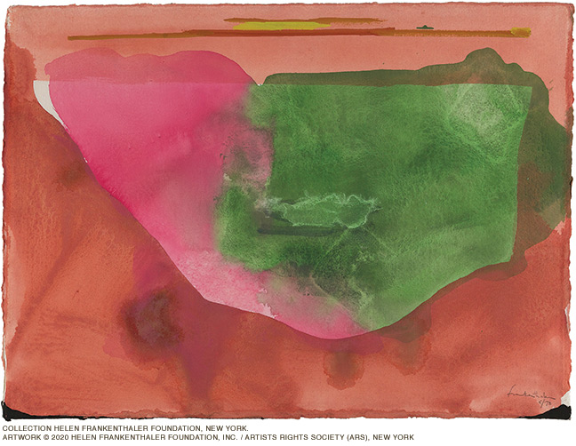
Fiesta, the signature image the Arthur Ross Gallery has chosen for its current show, is an abstract work from 1973 dominated by four swathes of color. A rich caramel spreads in a crescent shape across the bottom; a pool of saturated rose and a patch of emerald green seep into its hollow; and a thin strip of coral stretches across its top. The shades are not pure—they bleed into and overlay each other. It’s classic Helen Frankenthaler, as are two nearby pieces that evoke other warm-climate locales: Sirocco (1989), whose stucco-like textures and terra cotta hues conjure the Mediterranean; and Santa Fe XII (1990), which channels the American Southwest with a deep ochre backdrop lit by brilliant bursts of reds, golds, and cerulean blues.
That these three works—two acrylic paintings on paper and a relief print on handmade paper, all on view through March 29 in Frankenthaler on Paper—rely neither on great size nor oil upon canvas for their impact may be surprising, but it doesn’t reduce their significance. “Frankenthaler was constantly pushing herself as an artist, using new media and techniques,“ says Lynn Marsden-Atlass, director of the gallery. “She considered these works on paper equal in scope and importance to her large-scale oil paintings.”
A key artist of the abstract expressionist movement, Frankenthaler is best known as a painter of monumental works such as Mountains and Sea (1952), which remains her most famous piece. To create it, the 23-year-old artist laid a huge unprimed canvas on the floor and then soak-stained it with gentle washes of peach and turquoise and celadon. The result presented not the bold drips and gestural slashes of Jackson Pollock, but a smoother application that emphasized instinctual movement and contemplative response. In a 1960 interview with Time, Frankenthaler described her work as offering an “amorphous inner-world perspective … [it’s] a matter of making some kind of beautiful order out of human feeling and experience.”
This show often shrinks the scale, but in doing so reveals Frankthaler’s sensibilities in a distilled form.
“Whether she’s drawing on stone for a lithograph or painting with acrylic on paper to achieve the same soak-stain effect that she did on canvas,” Marsden-Atlass says, “these pieces show the same concern with color, line, and feeling as her more famous works do.”
The 17 prints on display document Frankenthaler’s experimentation with a wide range of techniques—including silkscreen, aquatint, woodcut, etching and drypoint—and were created at studios in San Francisco, Rome, Barcelona, Kyoto, and elsewhere. “Different print workshops specialized in different types of printmaking,” explains Marsden-Atlass. “They would invite Frankenthaler to residencies and she’d have an idea and would work with the printmaker to realize it.”
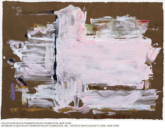
Nine acrylic paintings on paper are also on view, and they present intriguing comparisons to Frankenthaler’s more familiar oils. “They reflect the evolution of her work over time,” Marsden-Atlass says. “With Pink Palace (1978), for instance, we see her becoming more interested in creating emphatic mark-making on the painting’s surface.” This piece, astute observers will notice, quite literally bears the artist’s fingerprints—they’re there near the bottom of the painting.
The majority of these works are on loan from the Helen Frankenthaler Foundation in New York; the sole exception is a privately held study for a set design commissioned by the Royal Ballet. (A companion exhibition at the Pennsylvania Academy of the Fine Arts, At One Stroke: Prints by Helen Frankenthaler, presents another set of prints donated to that institution by the Foundation.)
Frankenthaler produced her first print in 1961, but it would be another decade—after her solo show at the Whitney and the publication of her first monograph—before she began experimenting with the medium in earnest. “Working on paper can even replace working on canvas for me,” she noted. “That was never true before. More and more, paper is painting.”
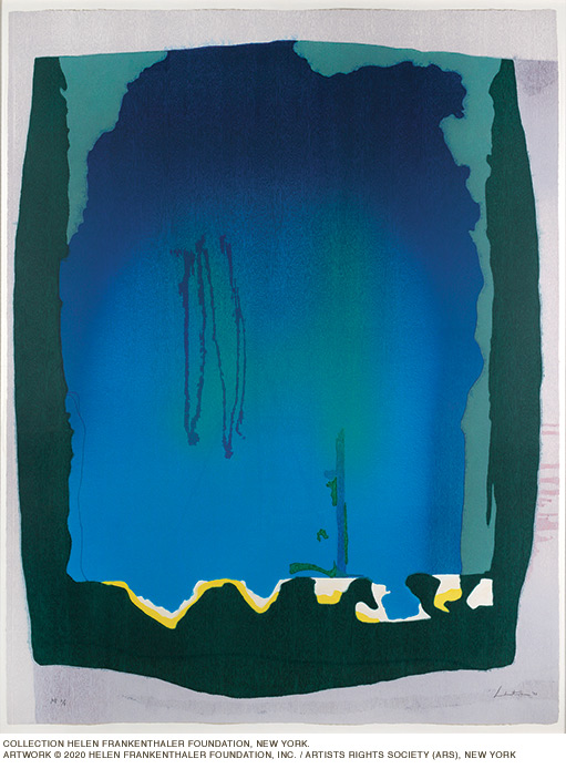
Freefall (1993), says Marsden-Atlass, “illustrates the seriousness and attention that Frankenthaler gave to the medium.” At over six feet tall and five feet wide, this magnum opus features a vivid cascade of cobalt, aquamarine, and emerald at its center, balanced by moody borders of inky black, grayish lavender, and murky greens. In contrast, the nearby aquatint Spring Veil (1987)is a much smaller, vibrant blend of fresh, luminous greens.
An earlier example of Frankenthaler’s penchant for exploring various media is A Little Zen (1970), which combines two printmaking techniques, pochoir (a type of hand stenciling) and silkscreen. Elsewhere, a pastel and crayon drawing that served as a working proof for Essence Mulberry (1977) incorporates a bit of mulberry juice from the tree outside the printmaker’s studio. The resulting woodcut, shown nearby, is printed on Japanese paper from four woodblocks. In its vertical orientation and composition it resembles a traditional Japanese scroll.
Printmaking is a realm of subtle variations, and viewers might furrow their collective brows trying to discern the fine but very deliberate distinctions between Frankenthaler’s chosen techniques, media, and paper types. After a while, though, this show rewards viewers willing to shrug their shoulders, give the brain a rest, and simply revel in the color and emotion. Just go with the flow, Frankenthaler-style.
—JoAnn Greco