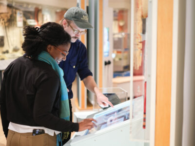
From the Colossal Sphinx of Ramses to a thousand-odd coins from Qing Dynasty China, there are roughly one million objects in the Penn Museum. And behind a great many of them lies an artifact most visitors are glad to be spared: paperwork.
But rare indeed is the collection that entered the Museum’s doors unprefaced by written correspondence. From negotiations with far-flung collectors, to expedition dispatches written on ocean-liner stationery, to invoices from exotic hotels, the Museum’s archives abound with paper trails—and some of them evoke a vanished era almost as keenly as the objects that gave rise to them.
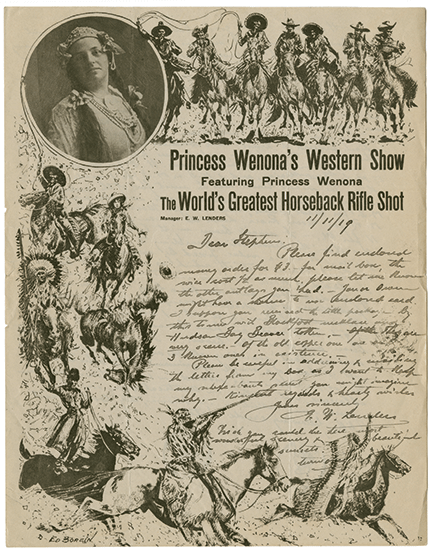
“To Whom It May Concern,” a small exhibition that runs through January, focuses on what might be called the golden age of letterhead. From the lushly illustrated stationery banner of Princess Wenona’s Western Show (which, in addition to featuring “the world’s greatest horseback rifle shot,” dealt Indian artifacts on the side) to the self-promotionally ornate insignia of the Suffolk Engraving and Electrotyping Company, the 157 letters on display testify to a stylistic diversity and ebullience that has all but disappeared in an era of bland electronic missives and staid corporate branding.
“You could say that the Museum was the first global institution at Penn,” says senior archivist Alessando Pezzati, who curated the exhibit. “Right from the start, it was sending out expeditions and writing to scholars and dealers and collectors all over the world. So we have letters from everywhere. And especially from the 1890s to the 1920s, typography and advertisements and exuberance just took off” in letterhead design.
Some of the exhibit’s specimens have fascinating backstories. In the letterhead developed for a 1931 expedition to Brazil’s Matto Grosso region, a jaguar shaped like the South American continent is bisected by a spear that exposes the project’s genesis as a “glorified safari” staged for the purposes of a feature film, Matto Grosso: The Great Brazilian Wilderness, released later that year. Its star, Alexander Seimel, was a Latvian stowaway who became a guide and hunter in the Matto Grosso region. As a specialist in killing jaguars that preyed on cattle herds, says Pezzati, “he apparently learned how to spear oncoming jaguars that were attacking him, and they wanted to capture it on film.”
Yet one of the film’s backers, E. Fenimore Johnson W’23, appears to have been just as interested in documenting native peoples whose land was being usurped. He asked Penn and the Museum, on whose board he served, to provide an ethnographer to lend the project legitimacy, according to a 2013 article in the Museum’s Expeditions magazine. In that role, Vincenzo Petrullo C’27 Gr’34 explored the remote upper reaches of the upper Xingu River Valley. And though the resulting film received mixed reviews—Pezzati calls it “mediocre”—the Library of Congress has deemed it the first field documentary to use synchronized sound, preserving a spoken American aboriginal language on film for what is believed to be the first time.
Other letterheads cast different reflections of their era. An 1898 document from Baugh & Sons Company, owned by Museum board president Daniel Baugh (after whom a third-floor gallery is still named), employed letterhead depicting the company’s giant Delaware River Chemical Works. Eleven massive chimneys rise from the vast factory, spewing thick black smoke.
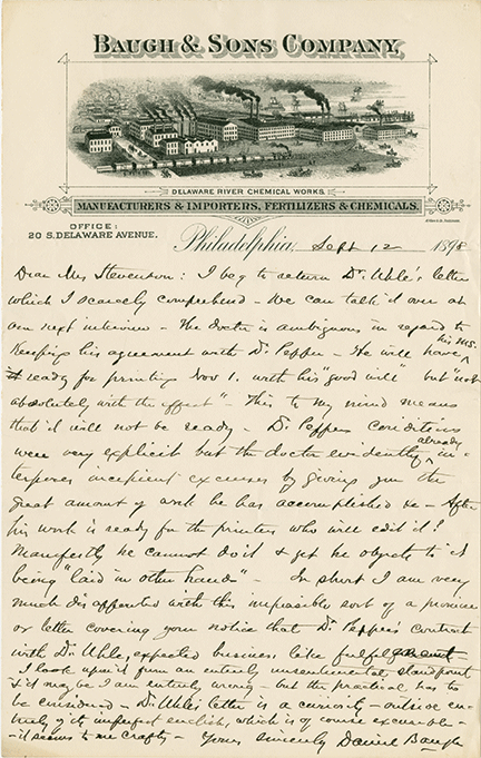
“Nowadays no one in their right mind would think this was a sign of anything good!” Pezzati marvels, remarking on the shifting symbology of progress and prosperity. “Now it would be painted green, with flowers and kids playing right outside.”
Some of the exhibition’s letters are reminders of the distance that can separate professional lives from personal interests. In the early 20th century, one H.K. Deisher engaged in a protracted correspondence with the Museum using letterhead that advertised the “men’s, ladies, and children’s ribbed underwear” manufactured by his knitting mill in Kutztown, Pennsylvania. “But his main passion was California Indian baskets,” Pezzati says. The Museum acquired some from him in 1918.
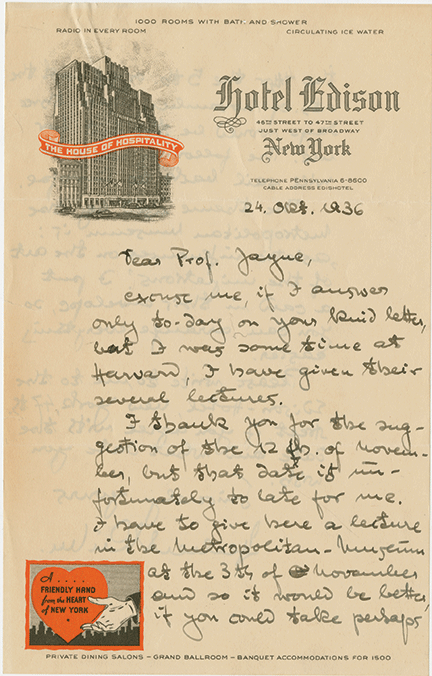
Among the many other curiosities—New York’s Hotel Edison, which in the 1920s used its letterhead to advertise “circulating ice water” and a “radio in every room”; the austerely unadorned typeface letterhead used by Harry Houdini in the year before his death—is a small section documenting the Museum’s own letterhead, whose evolution reflects the general denouement of the form’s diversity in recent times.
The Museum used its 50th anniversary, in 1937, as an occasion to incorporate imagery into what till then had always been an exclusively typographical banner. It featured a delicate, clay-colored line drawing of the Museum’s iconic building. A photograph replaced the drawing around 1958. Ten years later, the building vanished altogther to make way for a pair of playfully cartoonish figures, one Egyptian and one Mayan. In the 1980s, this duo was replaced by a Scythian winged stag, drawn from a broach in the collection. According to Pezzati, its handsomeness was not enough to win the affection of curators dismayed that a classical emblem purported to represent a collection of global scope. Today, the Museum’s letterhead reflects the spirit of our own age: unified brand identity. The imagery of yesteryear is gone, eclipsed by the mark that now defines nearly all of the University’s various schools, centers, and institutions: Penn, set in Perpetua font colored Pantone 288 CV blue. —T.P.