Architecture as marketing.
By JoAnn Greco

By Grace Ong Yan
Lund Humphries, 208 pages, $69.99
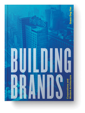
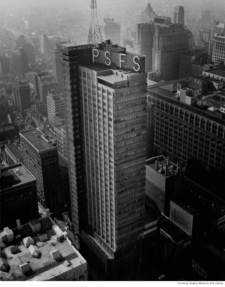
In 1932, architects George Howe and William Lescaze placed a very big, very bright neon sign on top of a new headquarters building in downtown Philadelphia. It read, simply: P S F S. With that gesture, advertising and architecture leaped light years into the future. In Building Brands, Grace Ong Yan Gr’10, assistant professor of interior design at Jefferson University, explores those fields’ intersecting trajectories by examining four corporate headquarters erected during successive mid-century decades.

It’s a novel approach. If we even consider buildings as branding agents—along with, say, packaging and logos and print ads—our thoughts reflexively turn to store design, or that of restaurants and hotels. “We think of corporate modernism as mute imposing glass slabs,” Ong Yan says. “But each of these buildings actually communicates directly with a wide audience—whether through its sign [PSFS Building], architect [S. C. Johnson & Son Administration Building], form [Lever House], or material [Rohm and Haas Building]. Corporate headquarters are like going to the heart of the matter, to the source of the goods being marketed,” continues Ong Yan, who has worked as an architect in the offices of I. M. Pei, Rafael Viñoly, and Renzo Piano, and in interdisciplinary branding design for Gensler, an architecture, interior design, and planning giant. “They’re a way of branding the company behind the products.”
Her book begins with the Philadelphia Savings Fund Society, whose headquarters was poised on the brink between Deco and Modern. Highlights of its design include a masterful blend of vertical and horizontal banding; a swooping, corner-hugging lower façade; and … that sign. More akin to a billboard, it’s tasked with searing the corporate name into the public’s consciousness. When the building’s designers argued that initials were the way to go—since they took up less space than the cumbersome name and thus could be much bigger and more legible—they literally created a new brand. “Though ‘PSFS’ would not regularly be used in the [bank’s] advertising until almost two decades later,” writes Ong Yan, “the acronym’s association with the institution began with the audacious sign.”
In each chapter, Ong Yan sets up each project with a brief look at the building’s location in time and space, then profiles the commissioned architects and their design choices. The corporation’s history—focusing on its advertising before, during, and after the construction of the new headquarters—rounds out each case study. Each chapter is illustrated with a plethora of architectural sketches and working drawings, as well as posters, brochures, and other advertising materials.
Ong Yan draws upon such ephemera—everything from a Corning glass advertisement to a Milwaukee Sentinel article—to illustrate how Frank Lloyd Wright’s involvement in the 1939 headquarters for the wax and polish maker S. C. Johnson was viewed as a noteworthy selling point from the beginning. And, she writes, the Racine, Wisconsin, building was a good thing for Wright too. Coming just as he was emerging from a dry spell, it thrust him firmly into the modernist era. Best of all, Ong Yan notes, Wright’s democratic ideals found affinity with the company’s progressive employment policies. With an open plan, skylit clerestory window, and organic dendriform columns, the building’s interior spaces presented a dignified place to work and served as a manifestation of Wright’s belief in an architecture that looked toward and embraced nature. To demonstrate how intrinsically linked the building and the company became, Ong Yan reproduces a pamphlet emblazoned with a graphic representation of the blob-like conical shapes of the columns.
Next, the 1951 Manhattan headquarters for another consumer products conglomerate, Lever Brothers, introduces the book’s first truly modern building. The work of a large corporate design firm, Skidmore Owings and Merrill, its form of a “tower on a slab” would jumpstart a spate of similarly-styled office buildings that would soon frame America’s downtown canyons. Swathed in striking green glass and raised on stilts, though, the building offered a little something extra and quickly achieved icon status. It needed no signs, no retail, no big-name design firm (although its lead architect Gordon Bunshaft would go on to gain individual acclaim). For Lever House, form most definitely did not follow function.

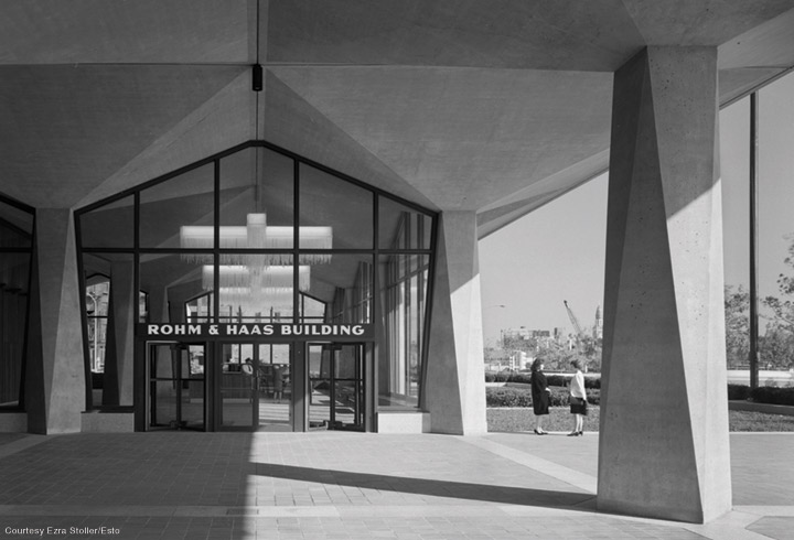
Ong Yan returns to Philadelphia for her last case study, the Rohm and Haas headquarters. Built in 1964, it offers at once the most subtle, and most direct, form of branding through architecture: the prominent use of a new material (plexiglass) invented by the chemical company. Credited to the Philadelphia firm now known as EwingCole, the building’s exterior is largely the work of Pietro Belluschi, an Italian-born modernist and dean of architecture at MIT who was brought in as a consultant. Quoting minutes from a 1962 meeting, Ong Yan writes that it was Belluschi who advocated for incorporating plexiglass “in a manner expressive of its inherent qualities and not to duplicate other building materials.” Used most extensively in the signature louvered sun screens hung on the upper floor windows, it also popped up consistently inside, from the doorknobs to the lobby chandeliers.
So, where do we go from this “apogee” of a “comprehensively branded environment,” as Ong Yan terms it? As the marketing environment becomes increasingly cluttered with attempts to grab everyone’s attention, is branding through architecture even relevant anymore? In her conclusion, the author says yes, contending that “[w]ith the growing virtual nature of corporate identities today, architectural branding … is ever more important precisely because of the material presence of place.”
But Ong Yan concedes that as the pandemic continues to make working-from-home an increasingly viable option, the case for the corporate headquarters has weakened. “Everything is being rethought now,” she says. “Companies need to be fluid and recognize that even if they don’t require as much workspace, they can still use architecture to brand.” From the Woolworth and PSFS buildings to today’s skyscrapers, many corporate owners have always occupied just a fraction of the towers that carry their names, she points out. And even in the case of, say, Philadelphia’s two Comcast buildings, where the media company remains the majority tenant, the corporate name isn’t brandished. “And yet, when you drive on I-76,” she says, “you know who owns the buildings.”


